Michael Wagner, SOC/BA ’97, got the scoop on the impact of the built environment on people as a Staten Island Advance transportation reporter in the early aughts. A love of storytelling and urban form that began in newsprint now comes to life in brick and mortar in each project for the Little Diversified Architectural Consulting design principal: mixed use, office buildings, schools, and more.
“Architecture is the stage set of our lives,” says the Raleigh, North Carolina, resident. “Having the opportunity to shape space where people live, work, play, shop, and dine is what keeps me motivated.”
Thirteen years in architecture have taught Wagner that a site’s “context and history inform what it becomes.” Each design is a complicated puzzle of costs, regulations, geometry, and research waiting to be solved.
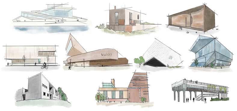
From sketch to structure, they've stolen the show. Here are Wagner's 10 favorite buildings:
Norwegian National Opera and Ballet: Snohetta’s iconic design weaves the Norwegian landscape—glaciers and ice sliding into the water—into Oslo’s urban fabric, creating an awesome public space.
Outpost: Olson Kundig has designed so many stunning houses. Perfectly sculpted, Outpost is all about contrast, acknowledging the sanctity of the Bellevue, Idaho, landscape. It is a vehicle that observes and absorbs its surroundings.
Norwegian National Opera and Ballet: This otherworldly box from Snohetta reveres its context. I can’t think of a better way to experience the stark landscape than by sitting near a floating fireplace on a CNC-routed, sinuous wood form.
Clyfford Still Museum: This Allied Works project in Denver is balanced and simple—just wood and concrete. Nothing feels extraneous and everything is thoughtful, down to the concrete’s linear striations.
MAXXI: Zaha Hadid’s design lives up to the Rome museum’s slogan: “More than meets the eye.” Every space overlaps and intersects. The building itself is as much a part of the art as the works housed inside.
The Broad: A glass fiber–reinforced concrete skin of unique panels creates a gallery that’s awash in natural light while not detracting from the artwork at this LA museum. The way the DSR and Gensler–designed exterior touches the ground brilliantly points to its entry.
Seattle Central Library: Draped in a glass shell and placed on its site in a way that activates every level, this OMA library encapsulates Seattle’s vibrancy inside a vertically stacked building that feels like a city unto itself.
Therme Vals: Studying Peter Zumthor’s plans for this hotel and spa, you realize how rational it is, boasting a rich tapestry of interior spaces and an exterior of locally sourced stone that doesn’t try to emulate the surrounding Swiss Alps.
Tate Modern: It takes vision and courage not to touch the parts of a building that are naturally stunning. Opened in 2000, the museum from Herzog and de Meuron maintains the grandeur and civic beauty of this old London turbine hall.
The High Line: There is no better example of outdoor space being inserted into an urban fabric. DSR completely inverted the story of an abandoned rail spur, taking the vitality of New York’s street life to the air.